 Q magazine April 2009: The first thing i notice about the front cover of Q magazine is the big picture of the featured artist. This will atract many people to further look at the magazine because the artist (in this case Lily Allen) is probably very well known and it will reflect on the calibre of the magazine. The picture also looks very glossy and classy which will further improve the quality of the magazine. There is a lot of text but it is well managed as it is spread out to avoid cluttering and comes in different fonts and colours keeping it looking interesting, lively but at the same time chock-full of information that's easy to digest. Again, the simple colour scheme of grey, silver, black, blue and white (And of course the red Q) makes the magazine look great.
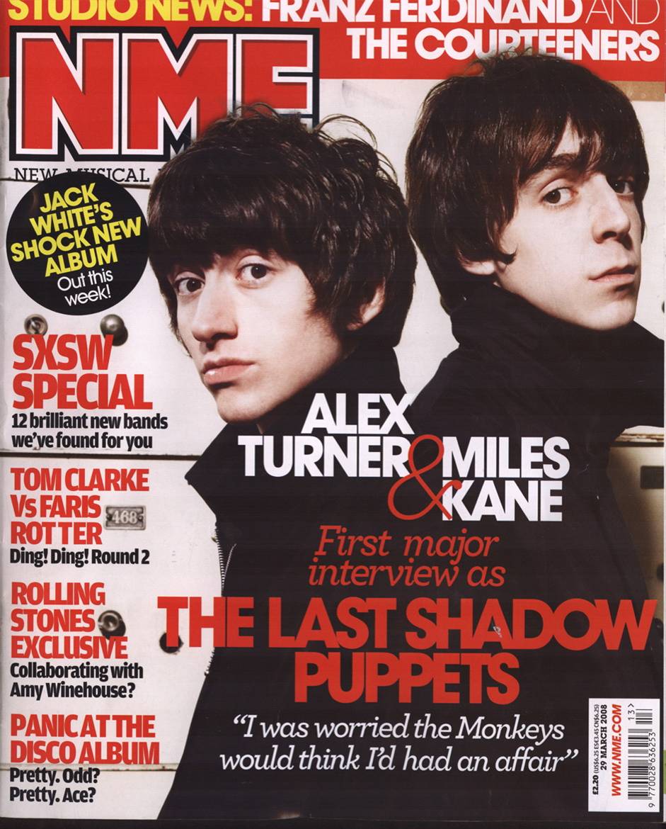
 NME magazine March 2008: The first thing that gets my attention on this magazine cover is the striking red, white and black colour scheme. This would suggest that the magazine is a bit "in your face" and suggests that it is aimed at a teenage audience and probably focuses on rock music or similar genres. The second thing i notice is the big picture of the two artists standing next to eachother in a rebelious-looking pose. This further suggests that the magazine is aimed at a teenage audience but also that the magazine is quite famous as it can afford to do an interview with well-known figures in music. The text in this magazine is often in a bold font and quite "in your face". Although it looks as if their is a lot of text it is easy to digest and it comes in easy to read blocks with just the right amount of information to let you know what to expect inside. The price (£2.20) is very small and in the corner so as not to attract the readers attention and pottentially put them off even though it is not a lot for a magazine.
No comments:
Post a Comment